Demos
#Module 2:
-
Open up Power BI, and in a new Power BI file use this workbook to "Get Data" from the spreadsheet "PA - CDs" (not: "CDs", but "PA - CDs". This is a special version of the CDs spreadsheet for these Practical Activities).
-
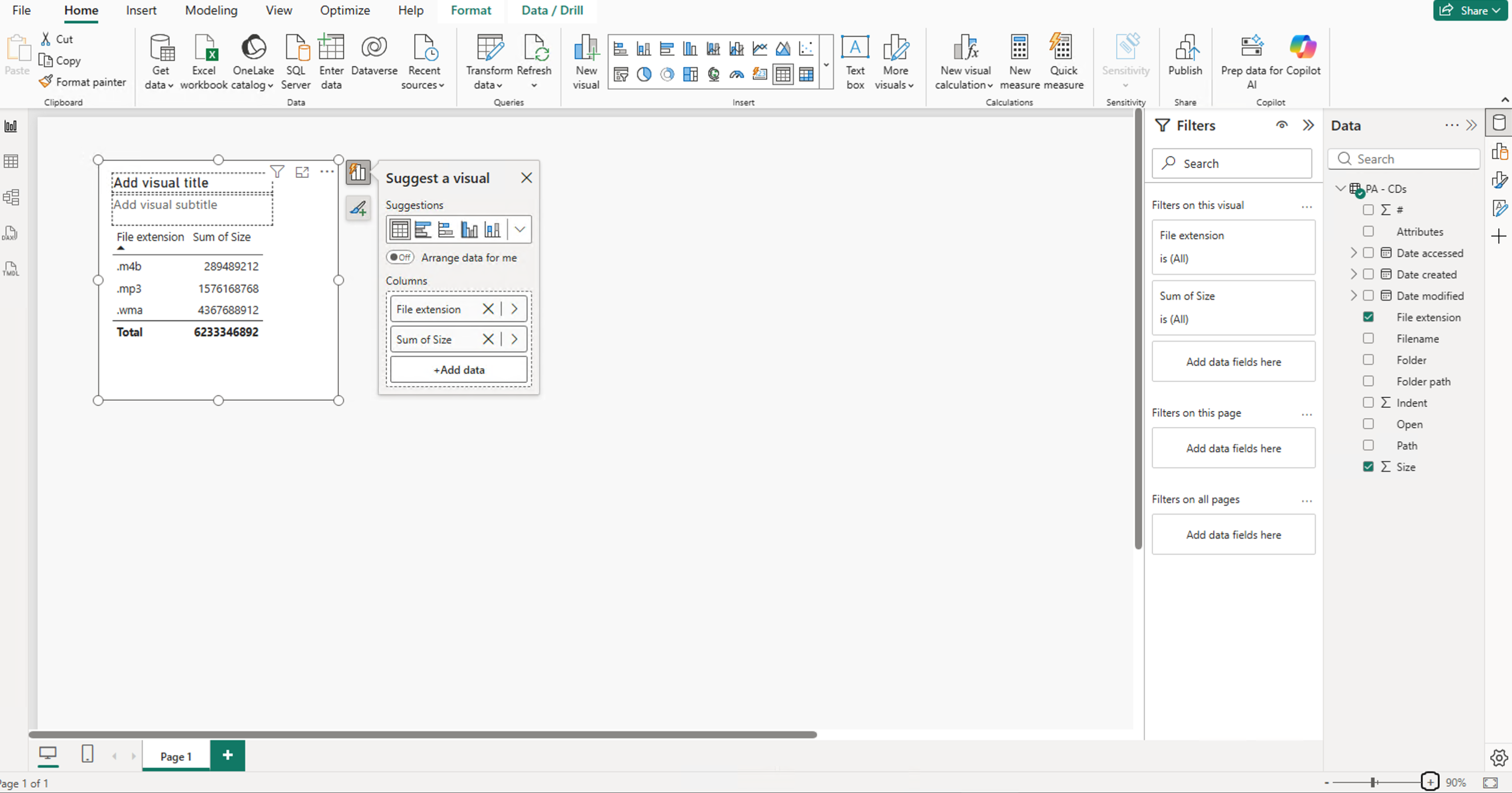
Click on the fields "File extension" and Size.
-
If this visualization is showing a bar chart, please change it to a Table.
-
Save this page to your local hard drive, and publish it to the Power BI service if you want to.
Module 3:
Get the data from the spreadsheet "PA - CDs" (from the workbook "PowerBIData"), and add the fields "File extension" and Size from the Module 2 Demo.
Then:
- Check the default summarization for the "Size" field.
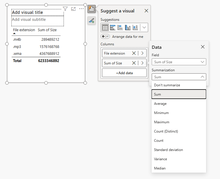
- Add the "Date created" field into the visual as well. Put it after the "File extension" but before the "Size" field.
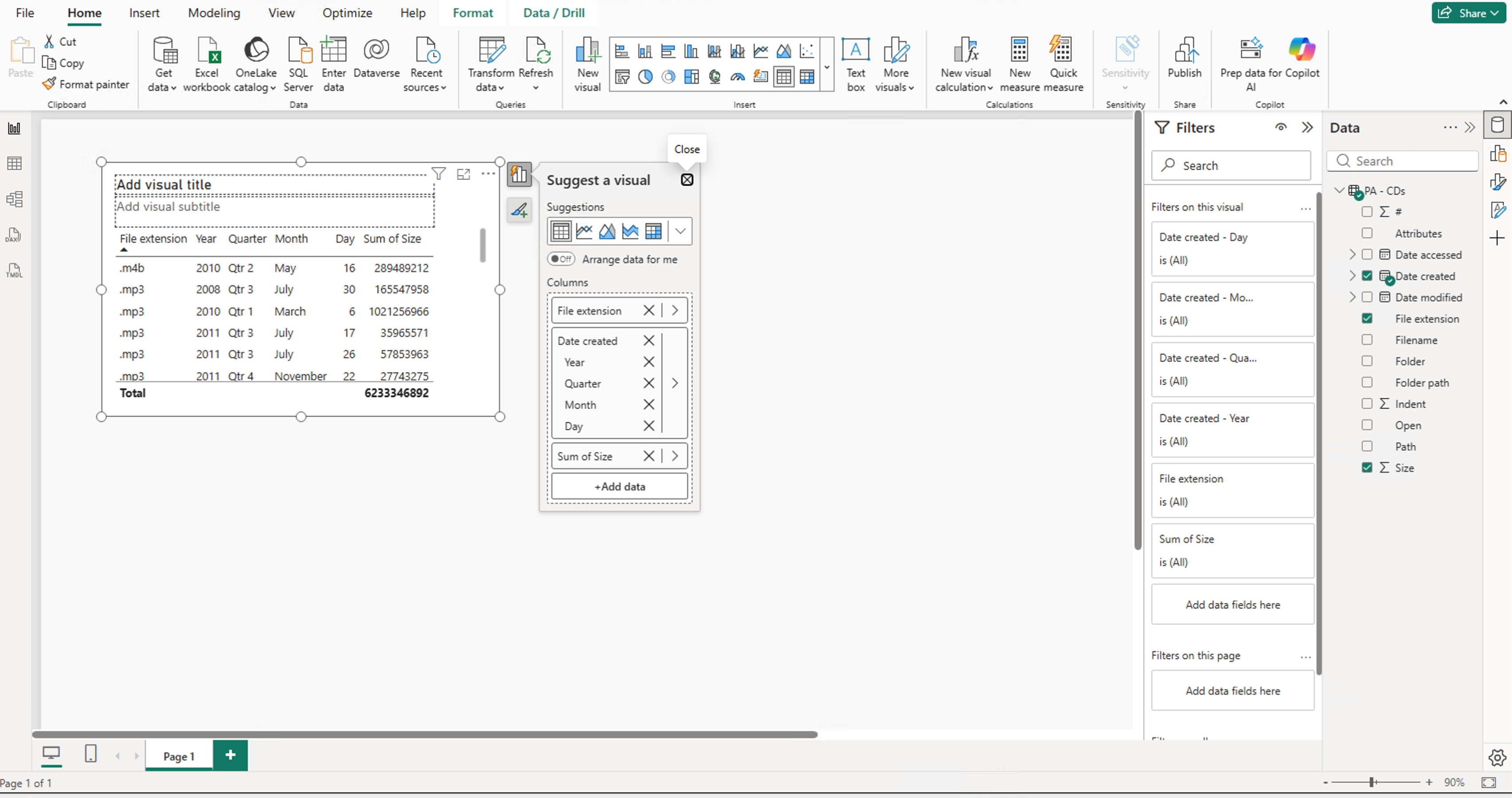
- Has it created a detailed hierarchy? If so, right-hand click on "Date created" in the "Column" well and select "Date created" (instead of "Date hierarchy") It absolutely has created one..
- Note: If it hasn't, then your system may have auto date hierarchies switched off. To switch it on, go to File > Options and Settings > Options > Data Load (Current File) > Auto Date/Time.
You'll need to change it to the "date Created" by right clicking and selecting Date Created.
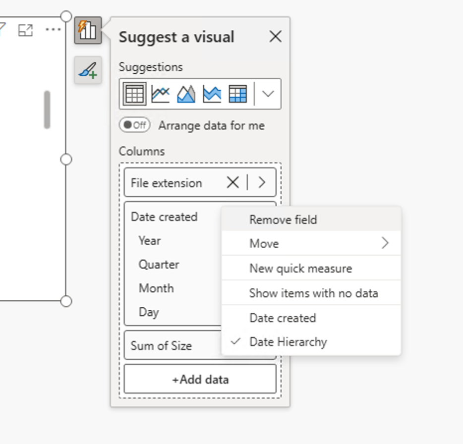
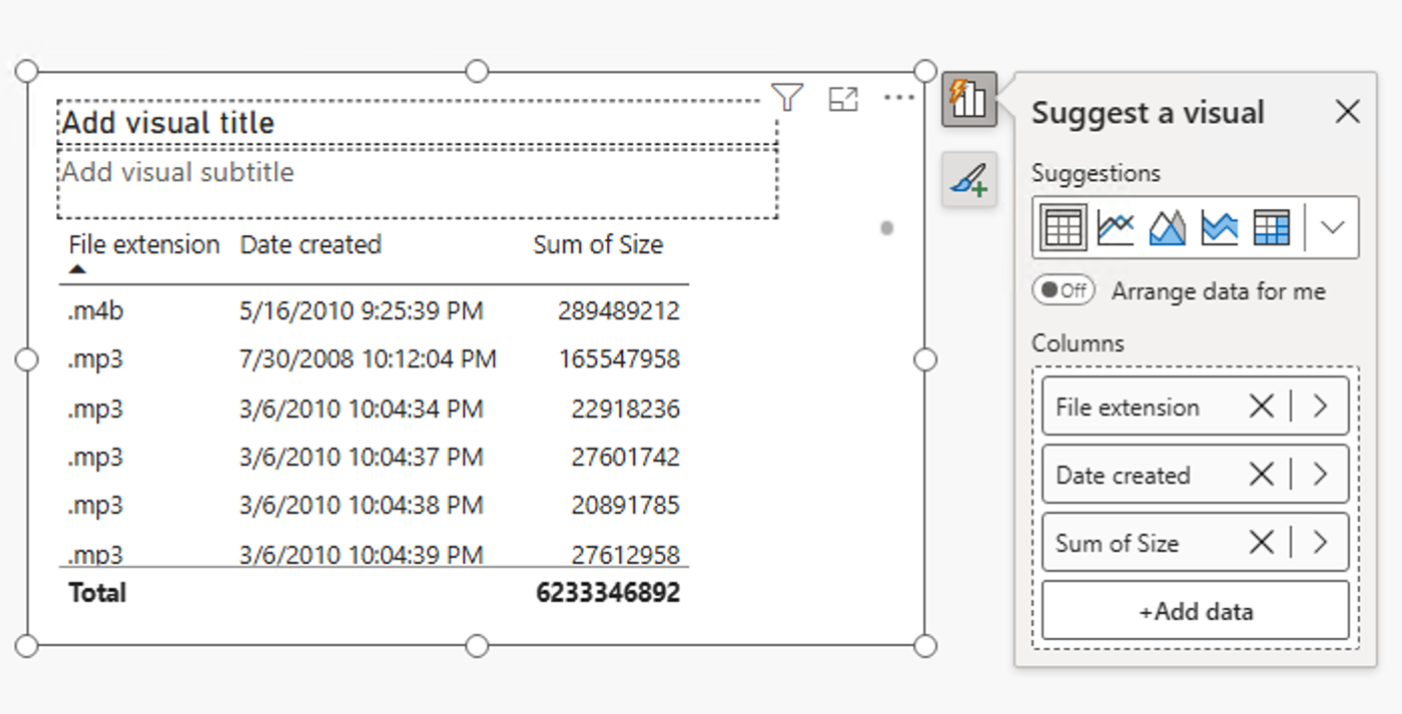
Gives you this:
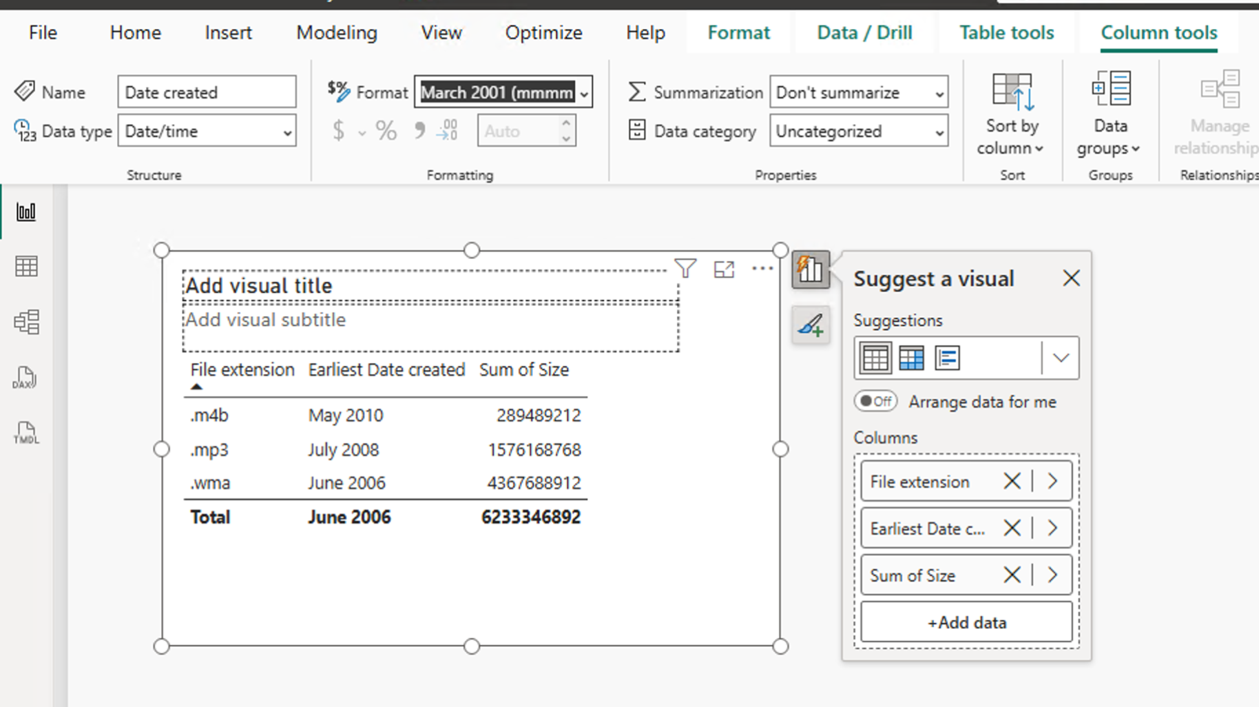
 4. Change the summarization for "Date created" to "Earliest", just for this visualization (don't change the default).
-
Change the default formatting of the "Date created" field so that it just shows month and year.
-
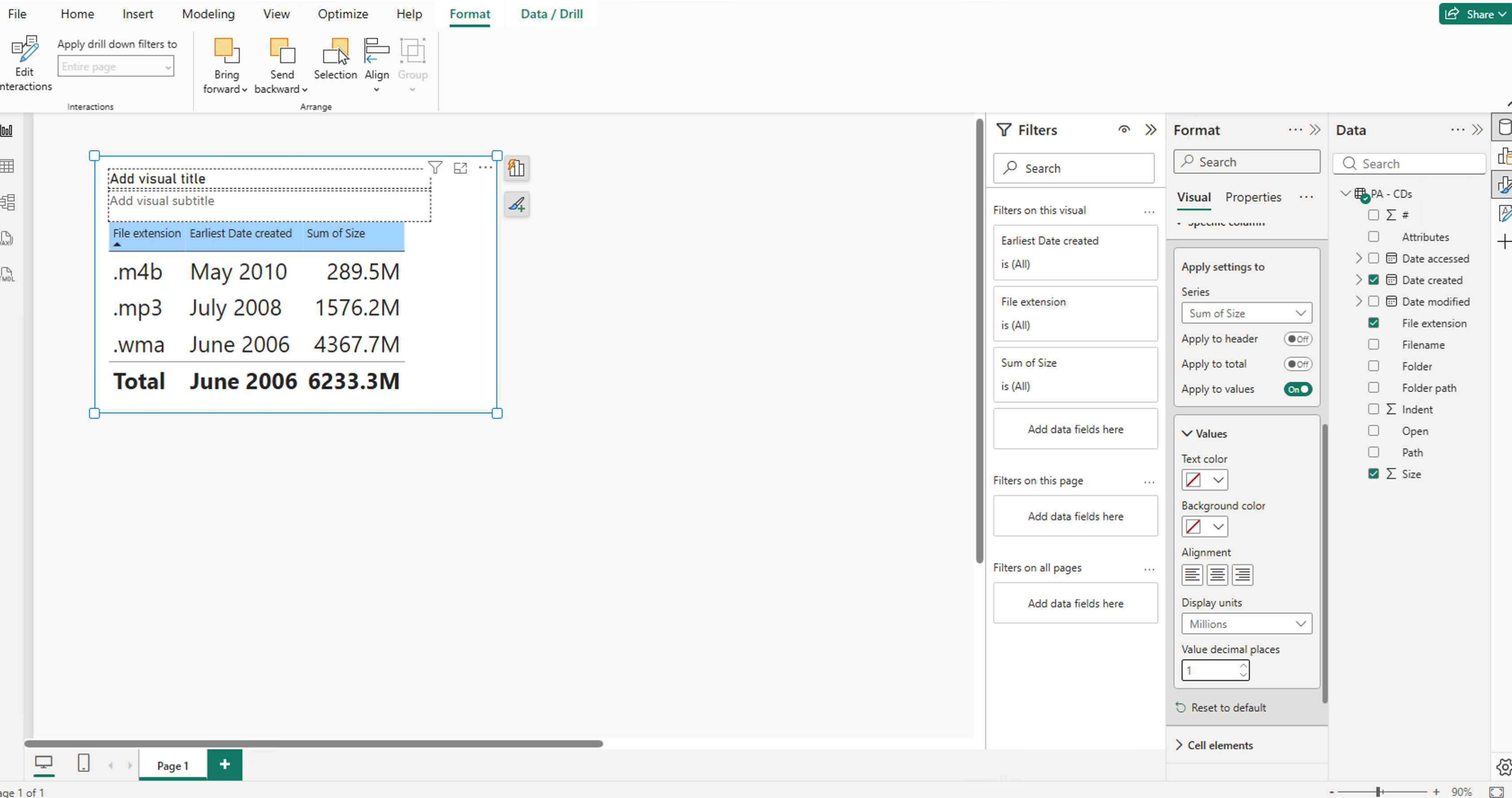
Change the font size of the visualization.
-
Change the colour of the header background.
-
Change the format of the "Size" field so that it displays in Millions of bytes.
-
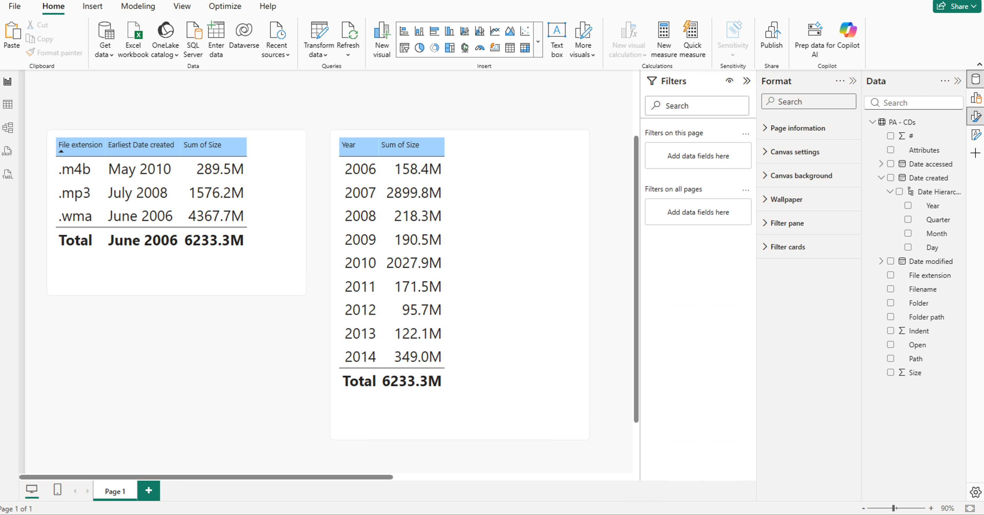
Copy this visualization to create a second visualization, and alter this second visualization so that it has just two columns: Year of "Date created", and "Size".
-
Move the first visualization so that the center of it is half way down the page, and move the second visualization so that the top of the visualizations are the same.
 Play around with these features to become excellent at this module. You'll need it to build onto the next demo.
Module 4:
-
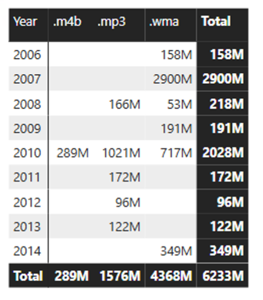
Create a Matrix, with Year of "Date created" in the Rows well, "File extension" in the Columns well, and "Size" in the Values well. Use the "alternating rows" style.
-
Change the formatting of the "Size" in this visualization only so that it displays in Millions.
-
Add "Quarter" into the Rows well. Have a look at the different options in Visual tools - Data/Drill - Data actions.
-
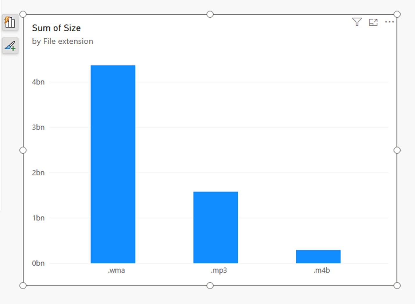
Add a second visualization, a Stacked Column Chart, with "File extension" in the X-Axis (or Axis) well, and "Size" in the Y-Axis (or Value) well.
-
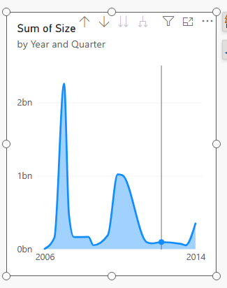
Add a third visualization, an Area Chart, with Year and Quarter of "Date created" in the Axis well, and "Size" in the Value well. If you are seeing only years, click on "Expand all down one level in the hierarchy" to show both Year and Quarter.
-
Edit the interactions, so that when you click on the first visualization, it filters (not highlights) the second visualization.
-
In the first visualization, click on the year 2010, and see what happens.
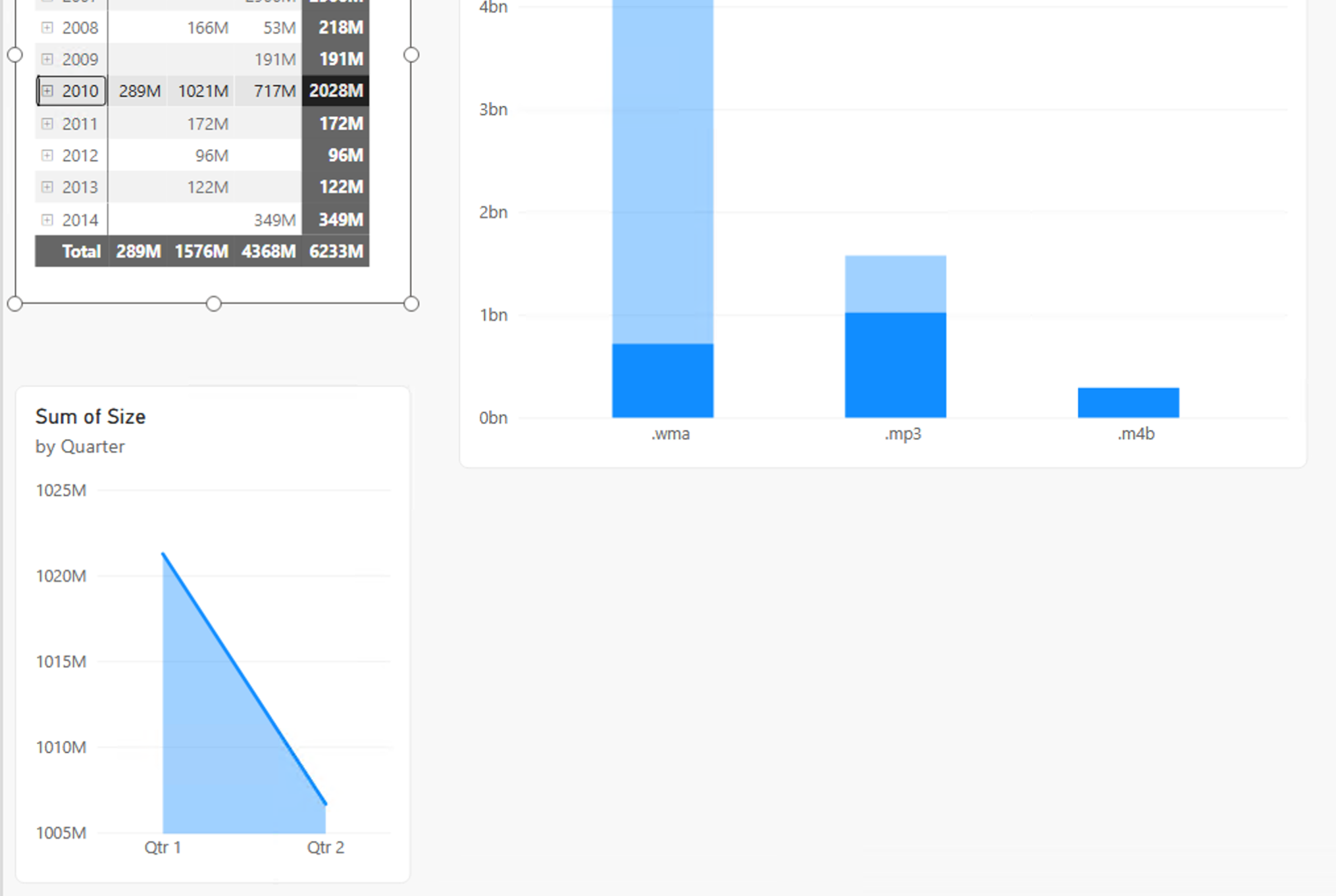 Play around with this as well.